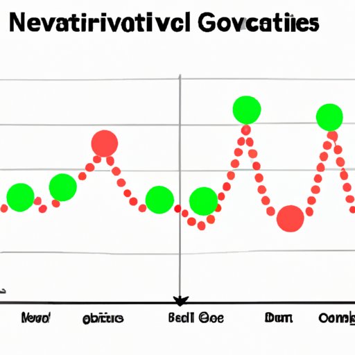
Deciphering Negative Correlations on Graphs: A Beginner’s Guide
Have you ever looked at a graph and wondered what it means? Perhaps you’ve seen a downward-sloping line that seems to indicate that two variables are related in some way, but you aren’t sure. Welcome to the world of negative correlations. In this article, we’ll explore what negative correlations are, how to identify them on graphs, and what they mean in a variety of different contexts.
The Do’s and Don’ts of Deciphering Negative Correlations on Graphs
The first step in understanding negative correlations is to learn how to interpret them properly. Here are some dos and don’ts to keep in mind:
Dos for interpreting negative correlations on graphs:
- Study the axis carefully – take a good look at both the x- and y-axis to determine what each variable is trying to represent.
- Pay attention to the slope – a negative correlation will have a downward slope, while a positive correlation will have an upward slope.
- Check the data points – do they seem to follow the general trend of the graph?
- Look for extreme outliers – if there are any data points that don’t seem to fit the trend, they may be skewing the results.
Don’ts for interpreting negative correlations on graphs:
- Don’t assume causation – just because two variables are negatively correlated doesn’t necessarily mean that one causes the other.
- Don’t assume a perfect correlation – there may still be some variation in the data, even if the general trend is downward.
- Don’t disregard other information – be sure to consider other factors that may influence the relationship between the two variables.
How to Identify Negative Correlation in Graphs: A Beginner’s Guide
Identifying a negative correlation on a graph is easier than it might seem at first glance. Here’s what to look for:
- A downward-sloping line – as mentioned earlier, negative correlations will generally be represented by lines that slope downward.
- A tighter fit – when there is a strong negative correlation, the data points tend to cluster more closely together.
- A clear pattern – the data points should form a clear pattern that is easy to spot even without drawing a line of best fit.
Of course, it’s important to remember that not every graph will have a clear-cut negative correlation. Some relationships may be more complicated or may not exhibit a strong negative correlation.
The Relationship Between Negative Correlation and Graphs: An Exploratory Analysis
So why do we even care about negative correlations? What’s the point of identifying them on graphs?
The answer depends on what you’re trying to study. Negative correlations can be indicative of a wide range of relationships between variables. Here are some examples:
- When studying economics, a negative correlation between the price of a good and the quantity demanded may indicate that as the price of the good goes up, people tend to buy less of it.
- In healthcare, a negative correlation between a certain treatment and a disease may suggest that the treatment is effective at reducing the likelihood of getting the disease.
In both of these cases, identifying a negative correlation can help researchers to draw conclusions about how different variables are related and make predictions about future outcomes.
Making Sense of Negative Correlations on Graphs: A Statistical Perspective
Now that we’ve covered the basics of identifying negative correlations on graphs, let’s take a closer look at the underlying statistics. Specifically, what do negative correlations mean from a statistical perspective?
At its simplest, a correlation is a measure of how two variables are related to each other. A negative correlation indicates that as one variable increases, the other tends to decrease. Conversely, a positive correlation indicates that as one variable increases, the other also tends to increase.
But what makes a correlation significant? In other words, how do we know when we’ve found a relationship that can’t be attributed to random chance? This is where statistical measures like correlation coefficients come into play.
A correlation coefficient is a value that indicates the strength and direction of a relationship between two variables. The coefficient ranges from -1 to 1, with -1 indicating a perfect negative correlation, 0 indicating no correlation, and 1 indicating a perfect positive correlation. The closer the coefficient is to either -1 or 1, the stronger the correlation.
Graphing Techniques for Negative Correlations: Tips and Tricks
Now that you understand the basics of interpreting and identifying negative correlations, let’s talk about some graphing techniques that can help you to visualize these relationships clearly. Here are a few tips and tricks to keep in mind:
- Use a scatter plot – scatter plots are great for showing the relationship between two continuous variables.
- Consider a logarithmic scale – if one variable has a very wide range of values, using a logarithmic scale can help to reduce the impact of outliers.
- Use color or shape to highlight certain categories – if there are multiple groups being compared, using different colors or shapes can make it easier to see how they differ.
Understanding Negative Correlations on Graphs: Implications for Real-World Scenarios
Finally, let’s talk about some real-world scenarios where negative correlations might be observed. Here are a few examples:
- Sales and price – in general, as the price of a product goes up, its sales tend to go down.
- Stress and physical health – studies have shown that increased stress levels are associated with a higher risk of developing physical health problems.
- Education and income – on average, people with higher levels of education tend to earn more money.
Identifying negative correlations in these contexts can help policymakers make informed decisions about how to allocate resources, how to design public health campaigns, and much more.
Conclusion
So what have we learned? In short, negative correlations are a useful tool for understanding the relationships between different variables. By learning how to identify them on graphs and interpret them properly, you can gain valuable insights into a wide range of real-world scenarios. Whether you’re studying economics, healthcare, education, or something else entirely, understanding negative correlations can help you to make more informed decisions and develop more accurate predictions.