I. Introduction
When it comes to data analysis, finding ways to effectively communicate complex information is essential. Chart types are powerful tools used to visualize data and identify patterns, making it easier for businesses to make informed decisions based on data insights. But with so many chart types to choose from, it can be challenging to identify the best one to use when dealing with multiple data series.
II. 5 Chart Types You Can Use to Display Two Different Data Series
There are several chart types that will allow you to cleanly and concisely display two different data series. Below are five of the most popular options:
1. Line Charts
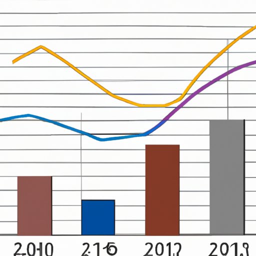
Line charts are ideal for presenting data series that can be connected with a line to create a trend. They’re commonly used for plotting time series data, which often contains two or more data series. Line charts are perfect for showcasing how two data series are related and can be used to identify trends, patterns, and outliers. They’re easy to read, but it’s important to keep in mind that they can become cluttered if too many data series are included.
2. Area Charts
Area charts are similar to line charts in that they showcase trends over time. However, instead of connecting the data points with a line, area charts fill in the space between the two data series with color. This type of chart is perfect for identifying how two data series diverge or converge over time, but it can be difficult to read if there are too many data series competing for space on the chart.
3. Stacked Bar Charts
Stacked bar charts are a type of chart that allows you to compare two data series in a single chart. Each bar is split into sections, and each section represents a different component of the data series. The sections that correspond to the same category are aligned on top of each other, creating an informative visualization of how the data is broken down across the different categories. While stacked bar charts are effective for two data series, they become quite difficult to read when there are more than that.
4. Scatter Plots
Scatter plots are great for showing a pattern or relationship between two sets of data. They’re great for identifying how two data series relate to each other and if there is any correlation. Scatter plots are not ideal for showing trends over time like line or area charts, but they are great for exploring how two sets of data interplay with each other.
5. Bubble Charts
Bubble charts allow you to display three pieces of data within a single chart. They are used to show the correlation between two data series, with the bubble representing a third data series. This type of chart is great for showing how changes in one data series affect the other while highlighting outliers in the data. However, it can be challenging to read if there are multiple bubbles competing for space on the chart.
III. Selecting the Right Chart Type: How to Display Two Different Data Series
When selecting a chart type to display two different data series, several factors should be considered:
1. The message you’re trying to communicate
The message you’re trying to convey through the chart should dictate the type of chart you use. Consider what you want to emphasize and how the different data series interplay before selecting a chart type.
2. The size of the data set
If the data set is extensive, it’s important to find a chart type that can display the data in a meaningful way without creating confusion and clutter. Line and scatter plots work well for smaller data sets, while stacked bar charts can work well for more comprehensive data sets.
3. The data series type
Some data series work better with different chart types. For example, time-series data is best suited for line and area charts, while categorical data works well with stacked bar charts.
IV. Two Birds, One Chart: Chart Types That Combine Two Data Series
Combination charts are chart types that merge two or more chart types into a single chart, allowing you to display multiple data series in one visualization. Several chart types can be combined to produce the desired effect:
1. Dual Axis Charts
Dual axis charts are a type of chart that allows you to display different data series with two axes on the same chart. They’re perfect for displaying data series that have different data scales. Dual axis charts can be challenging to read if the data sets are too different in magnitude, making it difficult to get a clear understanding of the visualization.
2. Side-by-Side Column Charts
Side-by-Side Column Charts allow you to display two data series by placing the bars for each data series side by side within the chart. They’re great for comparing two data series within the same category but become difficult to read when more than two data series are included.
3. Combo Charts
Combo charts allow you to display two or more different types of charts within the same visualization, creating a perfect tool for displaying data series that require different visualization types. Combo charts can be difficult to read if there are too many data series, but they provide a wealth of information and data insight.
V. From Dual Axes to Combo Charts: How to Show Two Data Series in One Chart
Combining two data series into one chart can create a more concise visualization of the data. Below are three chart types you can use to display two data series in a single chart:
1. Dual-Axis Line Chart
The dual-axis line chart combines two lines with different y-axes into a single chart. The chart clearly shows how the two data series relate to each other and where they stand against each other. However, it can be tricky to read if you have more than two data series.
2. Stacked Bar Chart
A stacked bar chart is another effective way to display two data series in a single chart. The bars show which data series have the largest values, allowing you to compare data quickly and easily.
3. Combination Chart
Combination charts provide a more comprehensive overview of the data by combining different types of visualizations into a single chart. For instance, you can use a line chart to show trends in one data series and a stacked bar chart to show the values of the second data series. This chart type is perfect for showing how different data series interact with each other but can be challenging to read with too many data series.
VI. Maximizing Data Display: Chart Types for Displaying Two Different Data Series
When dealing with two different data series, it’s important to maximize the amount of information you can convey through your chart. Below are two chart types that will help you do just that:
1. Waterfall Chart
A waterfall chart allows you to display two data series, such as revenue and expenses, over time. The chart shows how each data series has increased or decreased over a specific period. Waterfall charts are ideal for presenting data in a meaningful and visually engaging manner.
2. Candlestick Chart
Candlestick charts allow you to display stock prices by using two data series to create a visually compelling chart. The chart shows the opening and closing prices while using the two data series to create a display of trends.
VII. Conclusion
Chart selection is essential to convey complex information in a meaningful way. When it comes to displaying two data series, selecting the right chart type is critical. The right chart type will showcase patterns, relationships, and data type while providing your audience with a clear understanding of the data’s importance and message. By examining and applying these different chart types, you can make informed decisions and select the best visual aid to display your data.
To maximize the effectiveness of the chart, it’s essential to experiment with different types, understand their benefits and drawbacks, and choose the one that best suits your data and message. By identifying the right chart type and using its full potential, you’ll provide your audience with clear insights and make data-driven decisions.