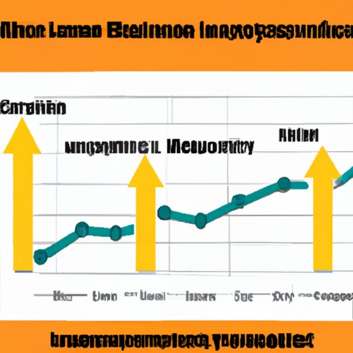
Learn how to add error bars to your Excel charts for accurate data visualization. From basic to advanced techniques, this guide covers tips and tricks for customizing and troubleshooting your error bars to improve your data analysis.
How to Create and Customize Graphs in Excel
Want to create sophisticated and impressive graphs in Excel? This step-by-step guide will show you a range of visualization techniques and customization tips to make data visualization a breeze!
Mastering Graphing: A Step-by-Step Guide
Learn the basics of graphing, explore popular software, highlight the importance of color schemes, show how to apply graphing in everyday life, and provide examples of data analysis in this comprehensive guide to graphing.
Understanding Class Width: A Beginner’s Guide to Finding the Best Range for Your Data
This article provides a beginner-friendly guide to understanding class width, including a step-by-step guide to finding the best class width, tips for maximizing data visualization, and best practices for avoiding common mistakes. By following these tips and recommendations, readers can determine the optimal class width for any data set and ensure that their data analysis is accurate and easy to interpret.

Column Filters in Widgets: Unraveling the Mystery and Mastering Its Power
Discover the power of column filters in widgets! This article provides tips and best practices on how to use them effectively for data analysis, visualization, and efficient data management. Learn why column filters are a game-changer and how it can make sense of data presentation in widgets.
The Ultimate Guide to Calculating Unemployment Rates: Method, Formula and Examples
Calculating unemployment rates is crucial to understanding the labor market’s health and the overall economy’s state. This ultimate guide provides a step-by-step breakdown of unemployment rate calculation, analyzes the different methods used, discusses the impacts of unemployment, and provides tips for accurate calculation and analysis.

The Power of Tables: A Comprehensive Guide for Displaying X and Y Data
This article explores the benefits of organizing X and Y data in tables. It provides a comprehensive guide on how to use tables to analyze data, input and format data, and display data using visualization techniques. The article also discusses advanced table techniques and helps readers to choose the best format for their X and Y data.
D3 vs Plotly.js: Which One is Better?
Choosing between D3 and Plotly.js can be a difficult decision. This article compares and contrasts the two libraries, covering five different comparison types: Comparison, Advantages and Disadvantages, User Experience, Case Study, and Hype Comparison. After analyzing each library’s features and capabilities, it is clear that both libraries offer unique benefits and readers should try out both libraries and determine which one works best for their individual needs.
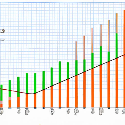
Creating Line Graphs in Excel: A Step-by-Step Guide
Learn how to create effective line graphs in Excel with this comprehensive guide. From beginner to advanced techniques, this article covers everything you need to know to master line graph visualizations.
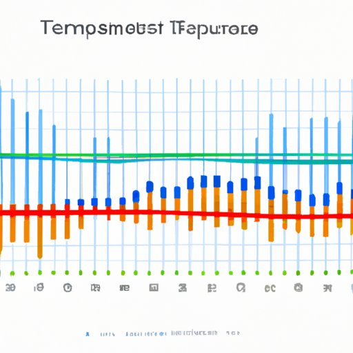
The Right Temperature Graph: How to Choose the Best Data Visualization
Explore the top 5 types of graphs for displaying temperature data, the factors to consider when choosing a graph type, and the pros and cons of different graphical representations. Learn how to effectively represent temperature for maximum impact with this informative article.