Introduction
RYB complementary colors are a fundamental concept in color theory, the science and art behind color interaction and perception. In the RYB color model, red, yellow, and blue are the primary colors that can be combined to create a vast array of secondary and tertiary colors. Complementary colors are pairs of colors that, when combined, cancel each other out to form a neutral gray or brown. Understanding RYB complementary colors is crucial to effective design, artwork, and branding strategies.
Understanding the Color Wheel: Complementary Colors According to RYB
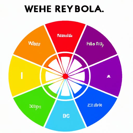
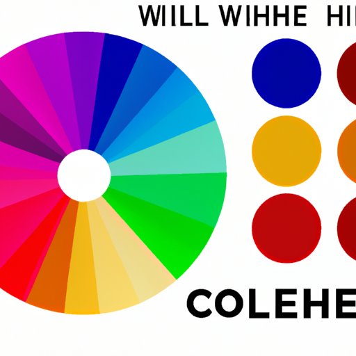
The RYB color wheel is a circular color chart that displays the primary, secondary, and tertiary colors in the RYB color model. The RYB color wheel differs from other color models, such as RGB (Red, Green, Blue), CMYK (Cyan, Magenta, Yellow, Black), and HSB (Hue, Saturation, Brightness), in its primary colors and color relationships.
Complementary colors according to RYB are pairs of hues that are positioned opposite each other on the color wheel. The three primary RYB colors create three pairs of complementary colors: red-green, yellow-purple, and blue-orange. These pairs are known for their contrast, harmony, and dynamic visual effects.
The Science of Color: Why RYB Complementary Colors Create Visual Harmony
The science behind why RYB complementary colors create visual harmony lies in color theory and perception. The human eye perceives color through a complex network of cells and chemicals that detect and process different wavelengths of light. When two complementary colors are placed together, they create a strong visual contrast that elicits different emotions and reactions based on their intensity and context.
Using RYB complementary colors in designs and artwork creates a balanced and dynamic visual experience that captures attention and communicates ideas effectively. The contrast between complementary colors provides both tension and resolution, leading to a more satisfying viewing experience.
Using RYB Complementary Colors to Create Stunning Designs and Artwork
To use RYB complementary colors effectively in artwork and design, consider their properties and how they interact with each other and their surroundings. Start by choosing the right color combinations based on your mood and message. For example, red-green is a high-contrast and dynamic pair that is suitable for conveying passion and energy, while yellow-purple creates a more subdued and elegant atmosphere.
Make sure to use a variety of shades, tints, and tones to add depth and interest to your designs. Additionally, you can add a third or fourth color to create more complex designs. For example, combining red-green with white or black can create different effects and moods.
Exploring RYB’s Complementary Color Pairs: How to Make Them Work for You
Each of the RYB complementary pairs has its unique properties, meanings, and associations. Understanding these properties can help you make more informed choices in your artwork and design. For example, red-green is associated with Christmas and the holiday season, while blue-orange is often used in sports and athletic branding.
Try combining complementary colors in different proportions and contexts to find the best fit for your needs. For example, using more green than red in a design can create a more organic and natural-looking composition.
Mastering RYB Color Combinations: Tips and Tricks for Perfect Pairings
To master RYB complementary colors, use the following tips and tricks:
- Choose colors based on contrast and harmony
- Use shades, tints, and tones to add depth and interest
- Experiment with different color proportions and placements
- Use complementary colors selectively and purposefully
By applying these principles and experimenting with different combinations, you can create stunning designs that capture attention and communicate your message effectively.
Maximize Your Design Impact with RYB Complementary Colors
To maximize your design impact with RYB complementary colors, consider the context, medium, and audience of your designs. For example, using bright and saturated colors in print and digital media can grab attention and create a sense of urgency. In contrast, using muted or pastel tones can create a more subtle and sophisticated look.
Pay attention to the color preferences and associations of your target audience and adjust your designs accordingly. For example, using yellow-purple in a branding campaign for a luxury product may not be suitable, as it is more associated with creativity and individuality than with luxury and premium quality.
The Power of RYB Complementary Colors in Marketing and Branding Strategies
Businesses can use RYB complementary colors to create stronger branding and marketing strategies that resonate with their target audience. By using the right color combinations, businesses can create unique identities, associations, and emotional connections with their customers.
Color psychology plays an essential role in marketing and advertising, as different colors elicit different emotions and responses. For example, red is associated with passion, energy, and urgency, while blue is associated with trust, calmness, and reliability.
Brands that have successfully used RYB complementary colors in their marketing campaigns include Coca-Cola (red and white), Nickelodeon (orange and green), and FedEx (purple and orange).
Conclusion
In conclusion, understanding RYB complementary colors is crucial to effective design, artwork, and branding strategies. By using the right color combinations, shades, and tones, you can create stunning compositions that capture attention and communicate your message effectively. Experiment with different pairs and properties to find the best fit for your needs, and don’t forget to consider the context, medium, and audience of your designs.
By applying the tips and principles discussed in this article, you can master RYB complementary colors and create memorable and impactful designs and marketing strategies.